
So, I have a lot of dates to deal with, and a lot of conflicting dates to try to make sense of.
After first trying to learn how to make a graphic timeline on my new Wiki (confusing, and definitely not good for a ton of info), I gave up and went hunting for a free site that would let me visualize (& color code!) the information in a useful way.
ENTER: time.graphics! (who knew .graphics was a TLD/domain ending??)
I'm quite impressed with it so far, particularly as a free site. Being able to see all the communities I'm looking at in this way has been super helpful in understanding the context of everything I'm researching.
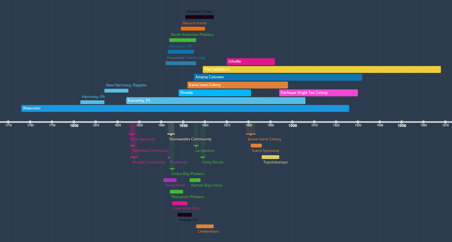
I also have a similar timeline with the lives of each person I'm looking at, and I'm starting to build individual timelines for each person as well. It's helped me catch a number of date contradictions from my sources!

There are a lot of features of this particular site that I haven't used, like the integration into Youtube, Google Calendar/Spreadsheet/Analytics/Maps and other things, so I can't really speak to those, but they're there!
That's it, really. I just wanted to share this since I've been finding it so useful!
No comments:
Post a Comment